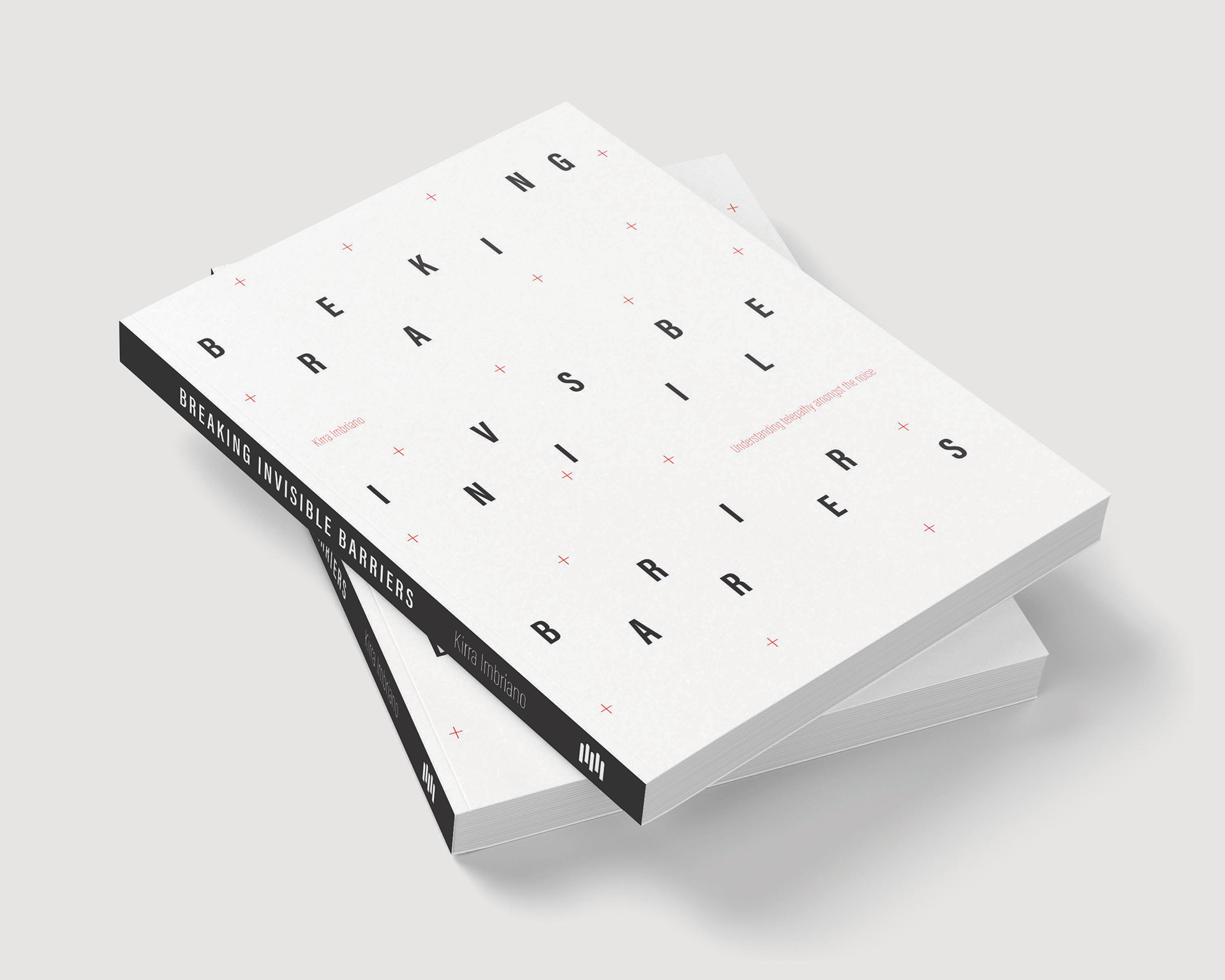
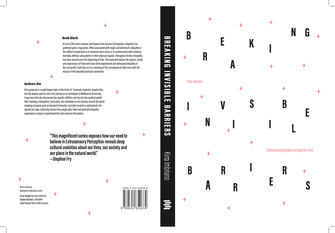
Book Cover Design
For this assignment, I was assigned telepathy as my ESP concept. I chose to focus my design on the theme of mental "noise"—the drifting and decoding of thoughts between individuals. To convey this, I fragmented the title and staggered the letters incrementally from left to right, creating an effect that evokes the motion and breakdown of a thought.
To enhance the design further, I scattered various plus signs across the front and back covers to symbolize the "noise" that fills the mind and generates a sense of organized chaos. This required mastering the left and right indent tools, which I hadn’t previously used. Additionally, I explored character and paragraph adjustments through lectures, online tutorials, and hands-on experimentation, gradually refining my skills. Through trial and error, I succeeded in arranging the letters to embody a structured disarray, much like the mind itself.
Color selection was also a careful process; I iterated on different palettes, incorporating feedback from peers, until I achieved a harmonious yet striking color scheme. This process encouraged me to simplify my design, focusing on clarity and uniqueness over complexity. In the end, I believe my cover successfully captures my vision while allowing me to explore new techniques and creative possibilities.
Brochure Design
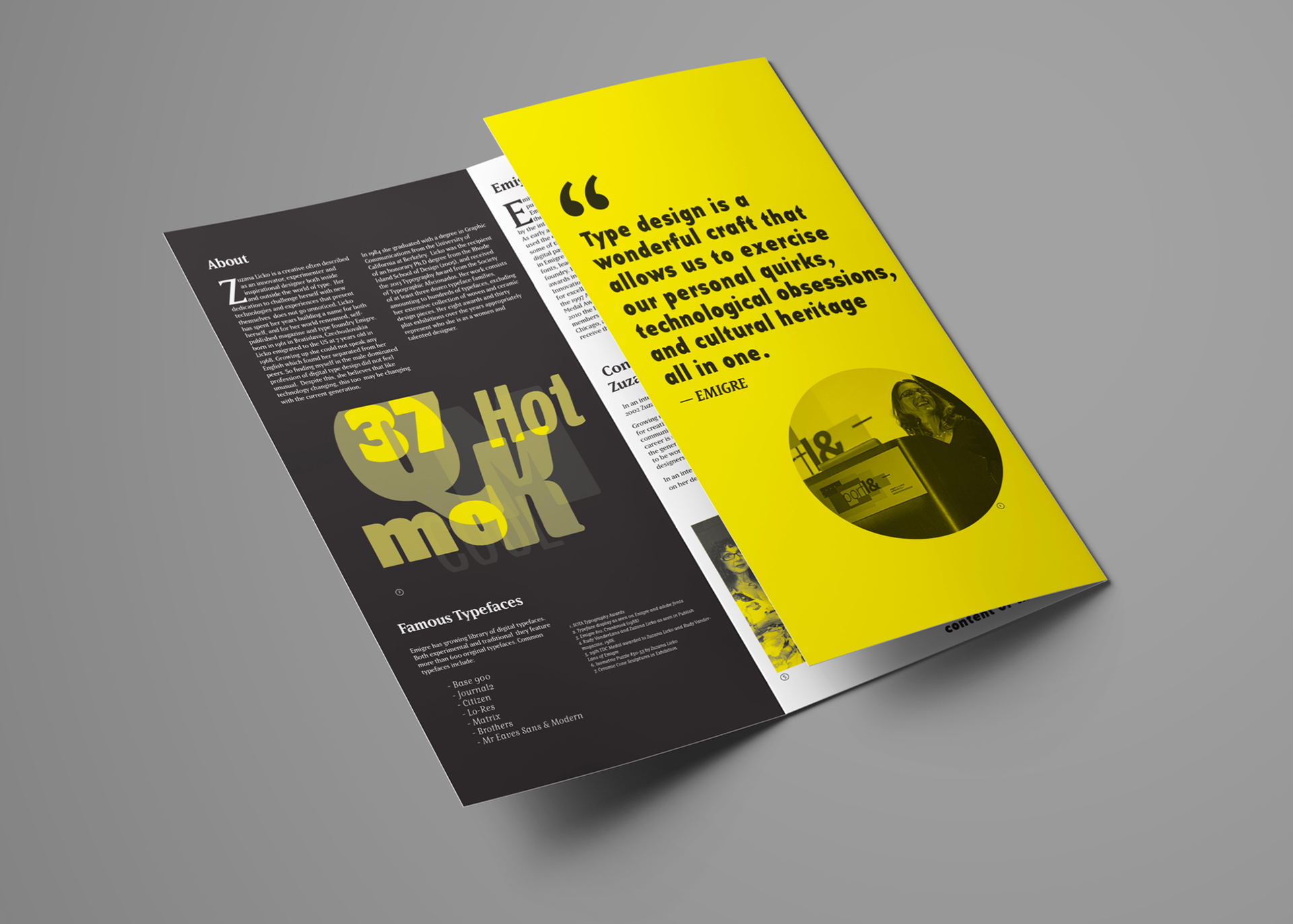
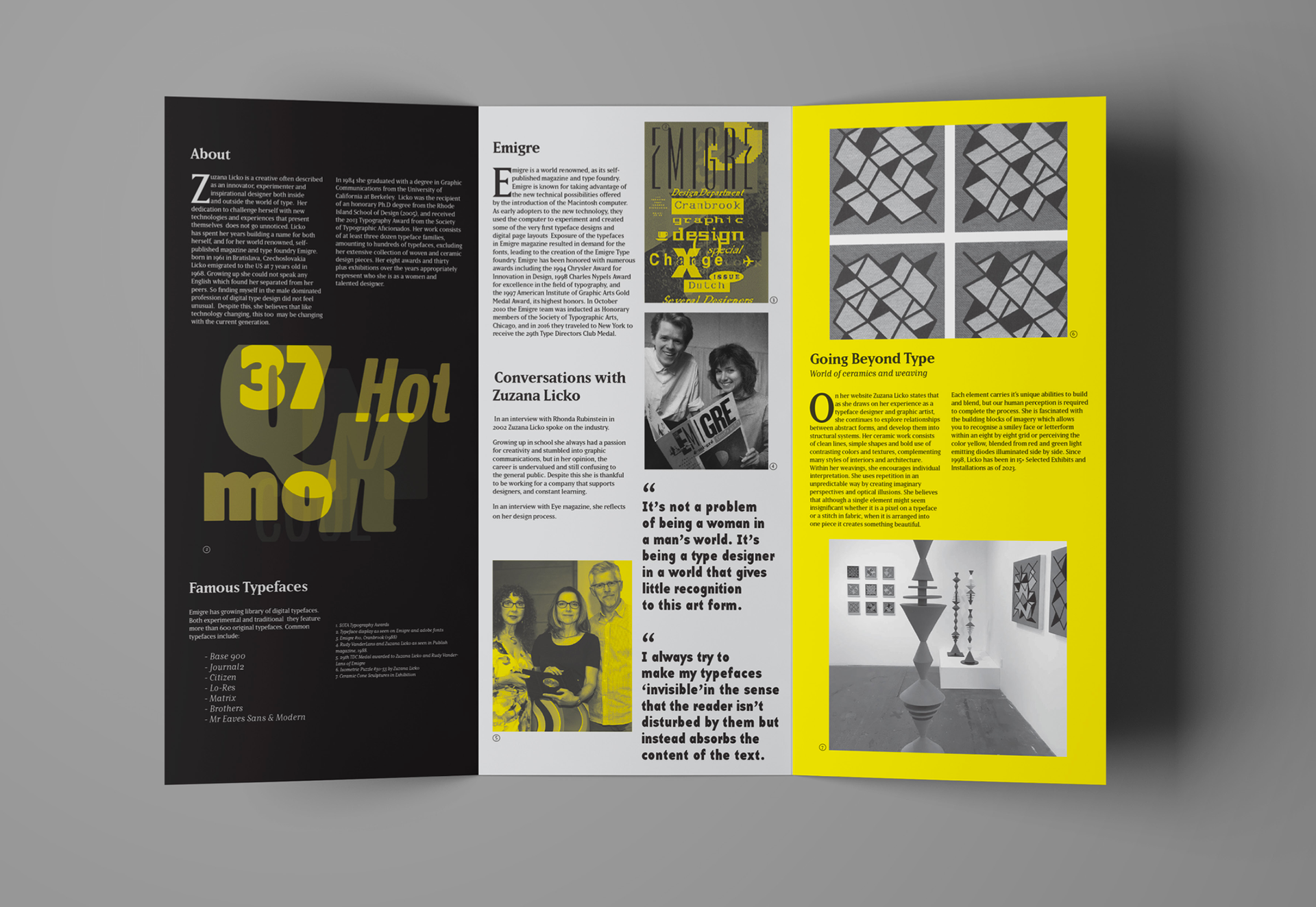
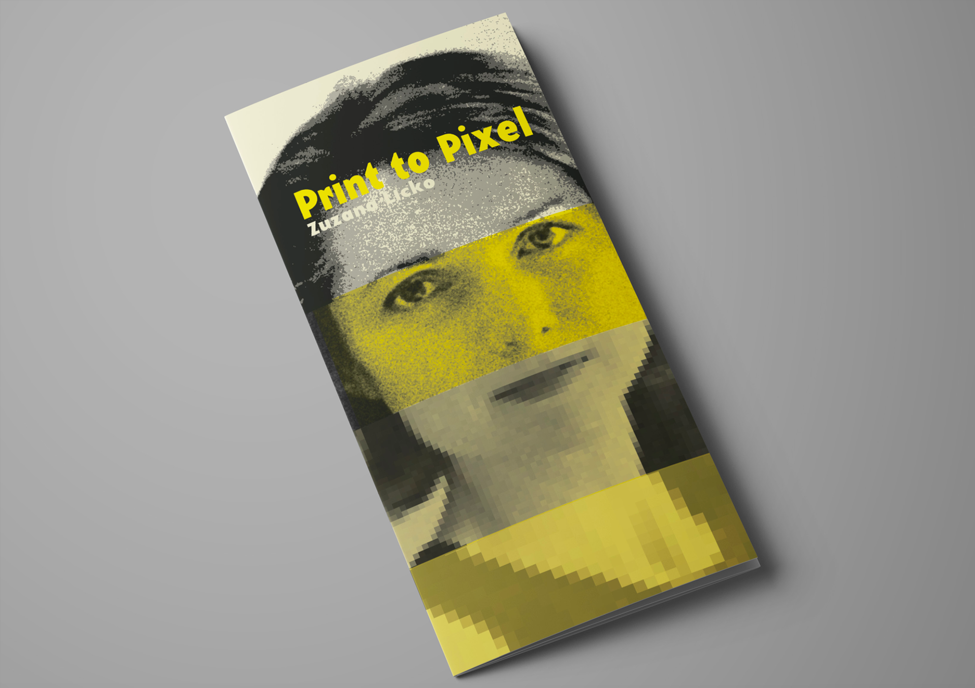
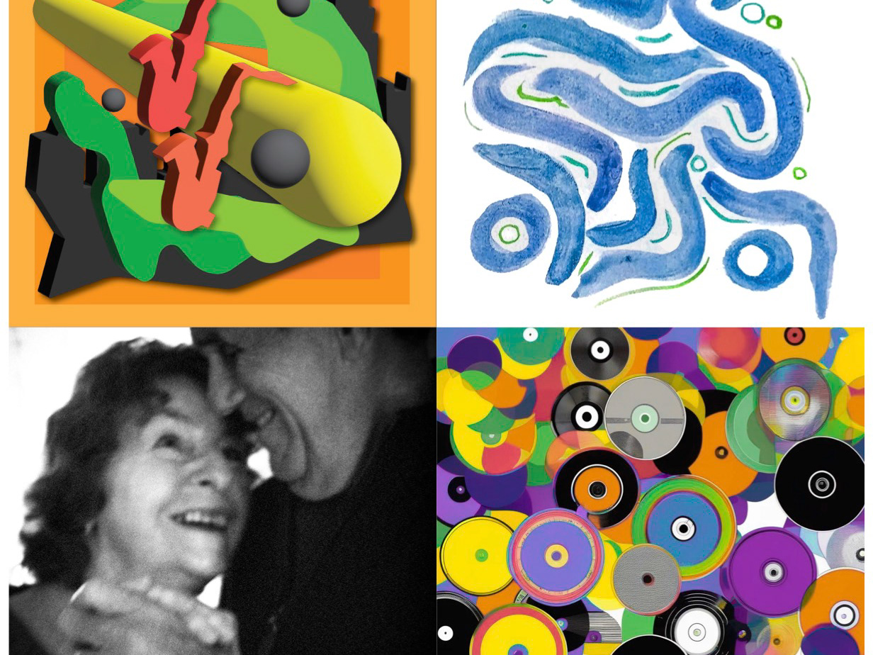
In my final design, I used typography to honor designer Zuzana Licko by selecting two complementary typefaces created by her and her company, Emigre. This choice subtly incorporated her renowned work into the brochure, aligning with her philosophy of understated yet impactful type design. I deliberately avoided highly expressive typefaces, inspired by Licko's own approach to creating "invisible" typography—fonts that allow readers to engage deeply with the content without distraction. This restraint placed greater emphasis on the information itself and its significance.
Yellow was chosen as a primary color, as it frequently appears in her work, symbolizing hope, confidence, and excitement—qualities that resonate with Licko’s own characteristics. Although orange is also prominent in her portfolio, yellow provided a bolder visual impact in line with the emotional energy of her designs.
Throughout this project in InDesign, I developed technical skills such as using grids to ensure even alignment across pages, which maintained the clean, precise look that mirrors Licko’s own meticulous style. I also experimented with tracking and font size in pull quotes, aiming to avoid awkward line breaks and achieve clarity and coherence in the layout. The brochure cover posed a further creative challenge, compelling me to thoughtfully split posterized and pixelized elements to enhance meaning and visual cohesion.
Overall, I believe the final brochure effectively highlights the most significant aspects of Zuzana Licko’s life and celebrates her remarkable achievements and ongoing contributions to design.